Use a table when readers compare values
Mark row and column headers in a plan comparison, preserve units and accessible names, and keep wide tables usable on narrow screens.

A table is appropriate when the relationship between a row and a column gives a value its meaning. In a plan comparison, “10” is not useful by itself. “Starter plan, projects: 10” is. HTML table headers express those relationships so readers can compare values visually and through assistive technology.
If you are choosing between a CSS grid and a table, ask what the reader needs to do. A gallery of independent cards is usually a layout problem. A matrix where readers compare the same attributes across plans is a data-table problem, even when the design calls for generous spacing and rounded corners.
Mark both directions of the comparison
This fictional pricing example has column headers for plans and row headers for features. The figures illustrate markup and do not describe an actual product.
<div class="comparison-scroll" tabindex="0" role="region"
     aria-labelledby="plan-comparison-caption">
<table>
  <caption id="plan-comparison-caption">Project workspace limits by plan</caption>
  <thead>
    <tr>
      <th scope="col">Feature</th>
      <th scope="col">Starter</th>
      <th scope="col">Team</th>
    </tr>
  </thead>
  <tbody>
    <tr>
      <th scope="row">Projects</th>
      <td>10</td>
      <td>100</td>
    </tr>
    <tr>
      <th scope="row">Members</th>
      <td>1</td>
      <td>20</td>
    </tr>
  </tbody>
</table>
</div>
The caption names the table as a whole. It can tell a reader what the values cover without repeating every header. The scope attributes describe whether a header applies along a column or a row. The WAI tutorial on tables with two headers uses this pattern for tables with both horizontal and vertical relationships.
A bold data cell does not become a header merely because it looks like one. Use th for the relationship, then style it. Likewise, making a header look visually quiet does not remove its semantic role. Screen-reader table-navigation commands rely on the structure rather than the font weight.
Keep values self-contained where practical
Units belong in the data model and in the presentation. A column of storage values can place a shared unit in the column heading, or individual cells can include their units when that makes comparison clearer. Mixing gigabytes and megabytes without labels forces the reader to guess.
An empty cell also needs a deliberate meaning. It might mean zero, unavailable, not applicable, or unknown. Those are different claims. Write a dash only when the table explains what that dash means; a short phrase such as “Not included” is often easier to understand.
Checkmarks need names when their meaning is not supplied by ordinary text. An icon alone may announce only an image or nothing at all. You can show a visual check while providing “Included” as text for the cell, and hide a decorative icon from the accessibility tree. The information should survive if a custom icon font fails.
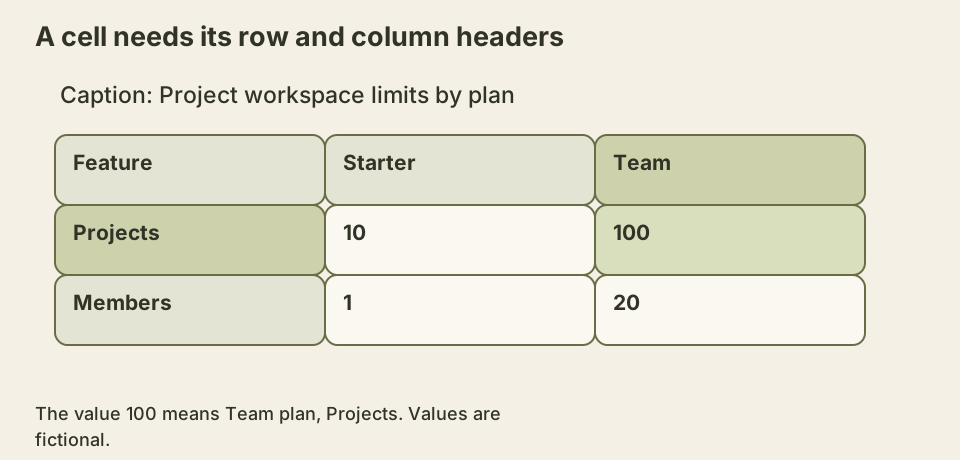
The crossing highlights explain why flattening the table into a series of unlabeled numbers would lose information. Both axes are part of the value’s meaning.
Narrow screens do not erase the relationships
A small comparison may fit naturally if text wraps and padding shrinks. A wide table may need a horizontally scrollable container. That container should not create page-wide overflow, hide its scroll affordance, or trap keyboard focus.
If keyboard scrolling requires making the wrapper focusable in your supported browsers, give it an accessible name and inspect how the extra focus stop feels in the full page. Browser behavior around scrollable-container focus differs, so test the actual support matrix. Avoid adding a tab stop to every table by habit.
Sticky first columns can help readers retain row labels while scrolling. They introduce overlapping backgrounds and stacking behavior, which need visual checks. A sticky header with a transparent background may become unreadable when another cell moves beneath it. Contrast must be checked in the scrolled state, not only at the initial position.
Turning each row into a card is another option, but it can make cross-column comparison harder. If you choose it, ensure that every value retains its header association and that CSS changes do not remove useful table semantics in the browsers and assistive tools you support. A design that looks attractive at 375 pixels can still make comparing two plans tedious.
Know when simple scope is insufficient
Grouped column headers and irregular spans can require more careful associations. A table with a “Monthly” group above several price columns and an “Annual” group beside it has multiple header levels. Explicit header IDs and headers attributes can describe complex relationships when simple scope cannot express them clearly.
Complex markup also creates maintenance risk. Changing a header ID without updating its referenced cells breaks the relationship silently. Before building a highly irregular table, consider whether the information can be split into simpler comparisons. That is a content decision, not merely an accessibility workaround.
Avoid using tables for unrelated page layout. A screen reader can expose row and column navigation where none is meaningful, and responsive rearrangement becomes unnecessarily constrained. CSS grid and flexbox already handle visual layout without claiming data relationships.
Give the scroll region a bounded job
The example’s wrapper is deliberately focusable and uses the caption as its region name. Add this CSS to a small page containing the markup. The minimum width creates a wide-table test case; it is not a requirement that every three-column table should occupy 32rem.
.comparison-scroll {
  max-inline-size: 100%;
  overflow: auto;
}
.comparison-scroll:focus-visible {
  outline: 2px solid #41492e;
  outline-offset: 3px;
}
.comparison-scroll table {
  inline-size: 100%;
  min-inline-size: 32rem;
  border-collapse: collapse;
}
.comparison-scroll th,
.comparison-scroll td {
  border: 1px solid #777;
  padding: 0.75rem;
  text-align: start;
}
.comparison-scroll caption {
  padding-block: 0.75rem;
  text-align: start;
}
At a narrow viewport, focus the wrapper and use an arrow key to reach the Team column. Tab should then leave the region for the next focusable control. Do not add a key handler that cancels Tab or rebuilds the browser’s scrolling behavior. The MDN overflow documentation discusses keyboard access to scroll containers and the benefit of a named region when an extra focus stop is needed. This fixture chooses an explicit stop so that its keyboard entry point is predictable; a production component should evaluate that choice in its supported browsers.
The table keeps its native element structure as it scrolls. The rightmost values must remain reachable, but the first column may move out of view. That is a real tradeoff for visual comparison. A sticky row-header column can help with a sufficiently wide viewport, yet a large sticky region can consume most of a small screen. Test the space left for values instead of assuming sticky positioning always improves the result.
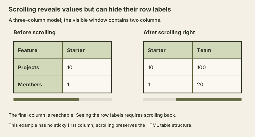
The WCAG reflow explanation recognizes that data tables can need a two-dimensional layout for meaning. That exception does not justify making the entire page scroll sideways or preventing text within cells from wrapping where appropriate. Keep surrounding headings and paragraphs in the ordinary page flow. In the fixture, the overflow belongs to the wrapper, and the focus outline makes that boundary visible.
Reconstruct a value’s context from the simple data shape
This console exercise converts the exact rectangular example into labeled records. It assumes one column-header row, one row-header cell at the start of each body row, and no row or column spans. The strings should include a record whose feature is “Projects”, plan is “Team” and value is “100”.
const comparison = document.querySelector('.comparison-scroll table');
const plans = Array.from(comparison.tHead.rows[0].cells)
  .slice(1).map((header) => header.textContent.trim());
const records = Array.from(comparison.tBodies[0].rows).flatMap((row) => {
  const feature = row.cells[0].textContent.trim();
  return Array.from(row.cells).slice(1).map((cell, index) => ({
    feature,
    plan: plans[index],
    value: cell.textContent.trim(),
  }));
});
console.table(records);
The result makes the comparison’s information model explicit. Copying only 100 would discard both labels; exporting a record preserves them. This is useful when checking a CSV export or a redesigned mobile presentation against the source data.
It is not an accessibility audit. The script uses cell positions and does not calculate the browser’s header associations. Remove a scope attribute and its output remains unchanged. That is precisely why a successful data export does not prove that assistive technology receives the same context. Inspect the native table separately, especially after adding spans or changing element types. The WAI multi-level table guidance explains explicit header associations for cases outside this simple shape.
As a follow-up, swap the two plan columns, moving each heading with all of its data cells. The same four labeled facts should remain after sorting the exported records. Then change only a heading and observe that the facts change even though all numeric cells stayed still. A table’s meaning lives in its relationships, so a visual redesign and a data migration need to preserve more than the numbers.
Verify a cell in context
Choose a middle cell and determine which row and column headers should identify it. Then inspect the accessibility tree or navigate the table with a screen reader to compare the exposed context. Repeat at a header boundary and on a cell containing an icon.
At narrow width and enlarged text, confirm that the final column is reachable and that no value disappears behind a sticky region. Copy a row into plain text and see whether its labels and units still make sense. The table is successful when comparison remains possible across these different reading modes.